Artist Conversation #2
Artist: Ana Alvarez, Kelsey Steuernagel, Eli Rodriguez, and Ricardo Corona
Exhibition: The Enchanted Boderlands
Media: Watercolor, digital, graphite, ink, gouache and acrylics
Gallery: LBSU School of Art, Merlino Gallery
Website: ricardocoronaart.com
Instagram: aadorisart and ricardocoronaart
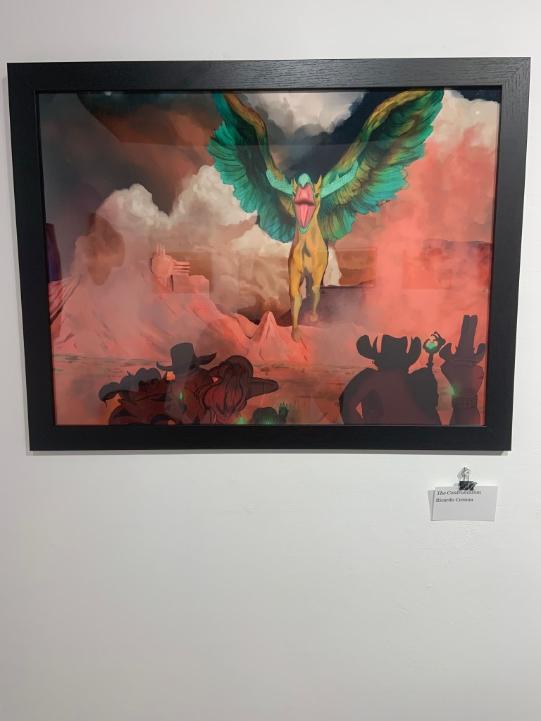
The Confrontation- in the middle
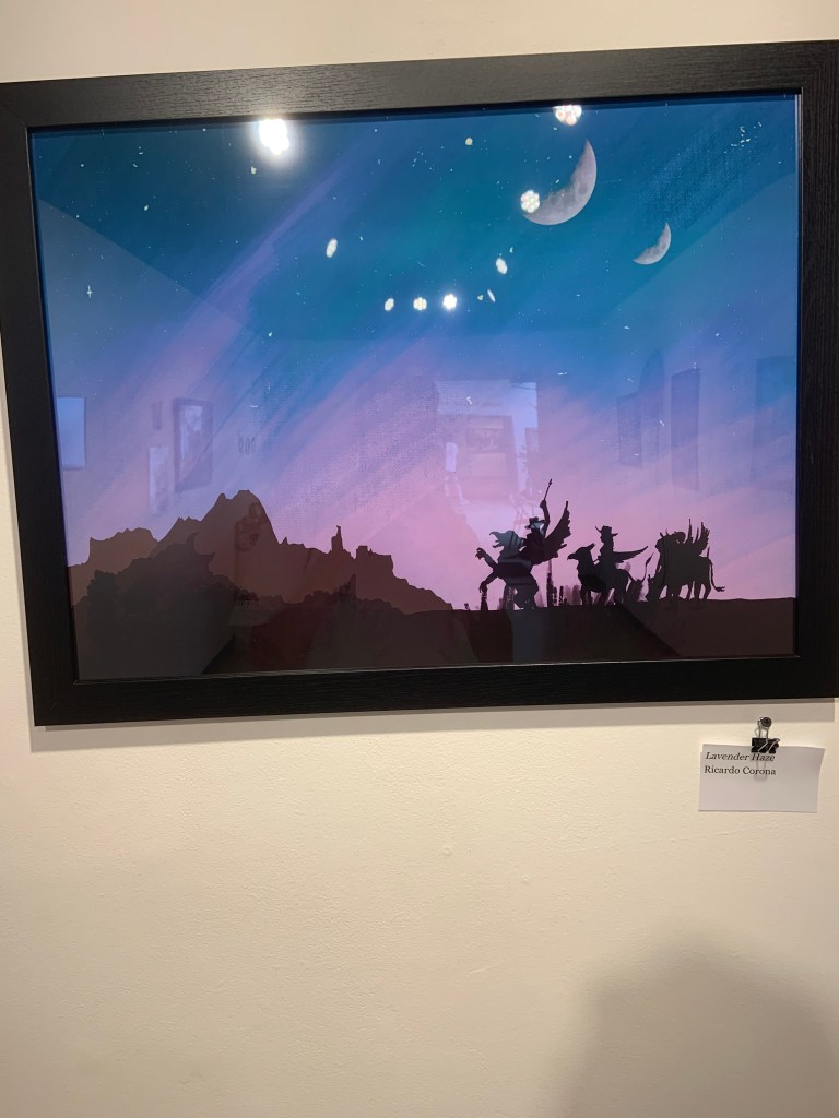
Lavender Haze- to the right
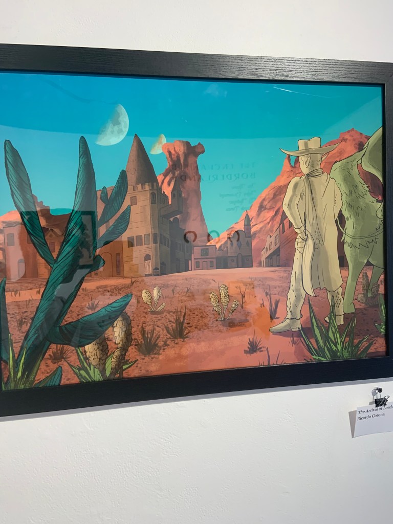
All by Ricardo Corona
1 About the artist
I was not able to find anything about Kelsey Steuernagel and Eli Rodriguez because they did not leave any cards and they were not there when I went. Ana Alvarez does character design and visual development. Ricardo Corona is a background artist, visual developer, and illustrator. This is his finally year at college and he is part of a BFA Pre-Production program. His goal is to create backgrounds for tv shows, videogames, and more.
2 Formal Analysis
The art was very large. The theme to me was western because of the dessert and how they looked like cowboys. Each painting was very colorful and very detailed even if the it was more of plain land. The details on it were incredible because the first painting background looks so real. All the lines how they are straight makes it look so realistic and how the rocks on the background look the most realistic. The texture is insane. It seems like if you touch the rock, you would be able feel it.
3 Content Analysis
This gallery was more about the backgrounds on how they are able to present it in this enchanted theme. That is why the characters are not as detailed as the back ground and the characters seem like a normal human but if you look at the ear, it looks like a elf ear. The artist show their amazing skills on the background. In the painting, Lavender Haze, Ricardo was trying to show how the sky would look out in the desert back when there was no light and it was just the moon or candles that gave you light at night.
4 Synthesis/ My Experience
I felt like they did really well displaying everything. The backgrounds were amazing and seemed very realistic. I think they could of drawn the characters a little better because the characters did not look that good. They looked more liked sketches and 2d compared to the background. In my opinion, I think the creature should of been side ways so we could see its body and the detail they may or may not put on it. I am a little confused on why there is two moons, but I believe it is because it has to do with the enchanted part of their theme. Next time I see them, I shall ask an edit my post here. Overall, it was great exhibit and I preferred this exhibit compared to the last exhibit. I can not wait to see what the next exhibit is going to be.
